
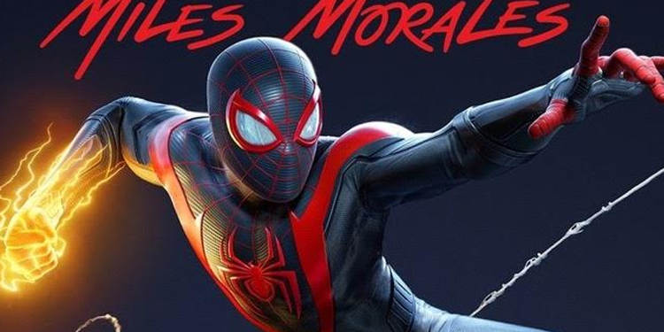
The PlayStation 5 is officially coming our way later this year. A few weeks ago, we got a peek at some of the games that will make their debut on the platform. That included the Horizon: Zero Dawn sequel and an all-new Spider-Man game from Insomniac Games. And now, we’ve got a good idea of what the box art will look like. Sony officially tweeted out a first glance at PS5 box art earlier today, featuring Spider-Man: Miles Morales. And it’s a change of pace from its current all-blue design for PlayStation 4, going with a white motif akin to what it’s doing with its PS5 hardware. Some folks are thrown off by it, but we’re digging it.
With that, we’ve decided to take a look back at PlayStation box art over the years, and how it’s evolved with each new platform. It started out simple, but has now grown into something that’s not only marketable, but also savvy and eye-catching. Let’s get started.
PlayStation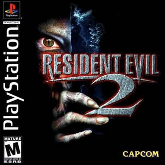
When the PlayStation launched in the mid-90’s, Sony went with a simple PlayStation readout that printed along the side of the front of the cover art. As you can see, it’s pretty effective, even though it doesn’t read “straight up” like it does on Nintendo cartridges. It works better that way, allowing us to see the full image on the front of the CD case. That said, an argument could be made that its cover art for its “Greatest Hits” games was a little bit ugly. Instead of solid black, it went with a light green design. Though this made the games stand out compared to its normal titles (indicating its $19.99 price point), it did look a little ugly by comparison. Take a good look on eBay and you’ll see more people are interested in hunting down an “original” copy of Castlevania: Symphony of the Night instead of its Greatest Hits edition.

PlayStation 2
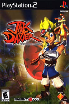
With the PlayStation 2 cover art, Sony decided to turn things right side up. It also changed format from CD cases to DVD cases, allowing for more room for cover art. This really paid off, making it much easier to read the PS2 header up top and get a better idea of what the game is about. Case in point with Jak and Daxter – the cover art just stands out. What’s more, it had a much better idea with the PS2 Greatest Hits games. Rather than going with ugly neon green, it instead opted for a solid red font, with the word Greatest Hits right underneath and not getting in the way of the cover art. It worked much better, while still showing very clearly the games that were going for a $20 price tag. In fact, these games still sit nicely on a shelf today, with the PlayStation 2 logo not getting in the way of the title, and making it easy to see in case you’re looking for that
specific game to play.

PlayStation 3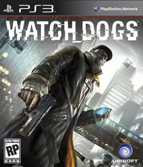
Sony changed things up again with its PlayStation 3 cover art. Instead of using the same DVD case as last time, it changed to a sort of Blu-Ray style case, since the system takes advantage of the high-end technology. When it began producing games, it went back to the “sideways” route, with the words “PlayStation 3” reading in Spider-Man 3 style format, and the cover art taking up most of the front space. But as later games came out, it changed it back to the top, with the letters “PS3” in black print and more room for the cover art on the front and side. It worked much better this way, making games like Uncharted 2 and Fallout 3 much more appealing to look at. For its “Greatest Hits” line, it continued to use the red font, but also switched to a red-colored box design, which worked wonderfully. This made a game stand out further in a collection, compared to the clear white cases that were used at the time.

PlayStation 4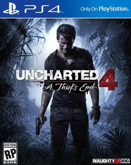
For the PlayStation 4, Sony went back to a “keep it simple” format. It immediately stuck with the “PS4” print at the top of the case, and then stuck with the color blue for both the front cover design and the box. This turned out to be an excellent choice for the platform, especially since the system lights up blue whenever it’s turned on. It didn’t change this design much with its line-up of $19.99 Greatest Hits games. However, it brought back the red font, with the words “PLAYSTATION HITS” in all capitals, making it easy to see which games were budget-priced. It works very well, and allows the titles to sit comfortably alongside full-priced games. Some people are fans of that, particularly those that didn’t like the neon green art of the original PlayStation games. Sony didn’t change this design much at all – not that it really needed to.

PlayStation 5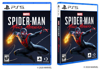
It’s too soon to tell just what Sony’s box art for PlayStation 5 games holds in the long- term, since games aren’t even on the shelves just yet. But, based on this peek at the Spider-Man: Miles Morales art, it appears to be sticking mostly with what worked with the PS4 art. Granted, the white side and front art is a change of pace from what the PlayStation 4 cover art had, even though the rest of the design is similar. This should help signify the game from those PS4 releases, while at the same time mixing in with how the PS5’s design comes across. Some people aren’t fans of that, but they really should stand out on a shelf. No word yet if Sony will stick with this for its Greatest Hits line-up, but it wouldn’t surprise us if it used red again alongside the white, making the game good ol’ red, white and blue. We’ll have to see what 2021 has in store as these games continue to sell.

In the meantime, we’re all for the PS5 cover art design. Now we just have to see if Microsoft continues to stick with green, or maybe goes with something black. Check out the trailer for Spider-Man: Miles Morales below! The PlayStation 5 – and its respective games – will arrive this fall.
